Feedback ticket
In general game runs smoothly I had no crashes at all. Game loading times are long though.
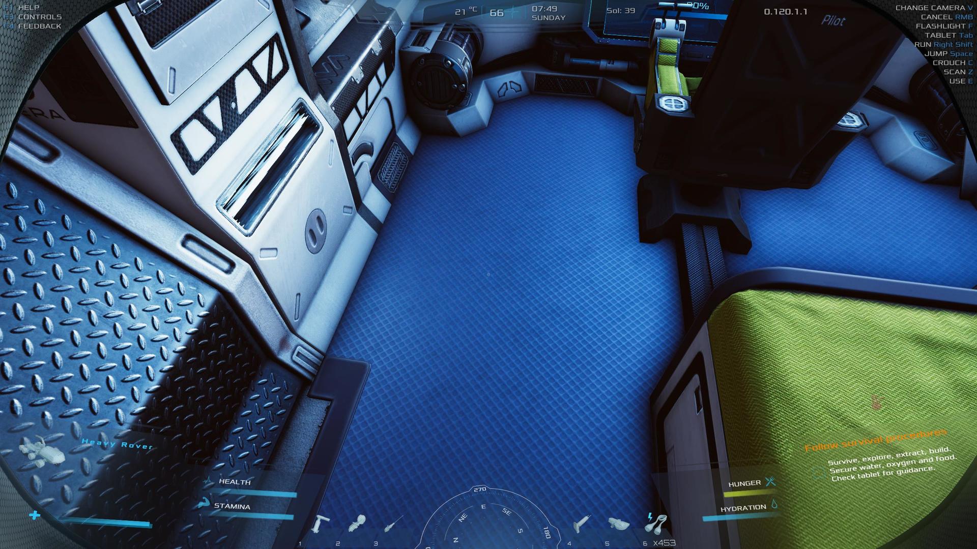
What troubles me most is the interface and some issues with gameplay.
1. The dot in the center is too small and sometimes I struggle to point at a switch or something else. A bigger pointer or alternative one would be great.
2. The interface is unreadable many info or details are impossible to see.
For example when I charge my suit it's very hard to read the percentage of charging. This applies on many other text and details, even the message when game is saved. You should put some dark background on text.
3. Like others noted animations force you to wait untill they are done. When I take on/off my helmet or opening a door.
4. When I take off my helmet I'm forced to 3d person view and moving to fast around I always have to switch back to 1st person view immediately. 3rd person view should not be forced. Instead an indicator when helmet is off.
5. Too many blueprints are required and Greenhouse that is so important for the course of the game should not locked with a blueprint. Too many bases to explore to get a single blueprint is unrealistic. 3-4 abandoned/destroyed bases would be more realistic and all blueprints/tablets you will need in those bases.
6. Sometimes switches are unreachable for some reason, the ones on the left.
Gameplay
Ok
0.0503176
Yes
0.120.1.1
Screenshot
