Feedback ticket
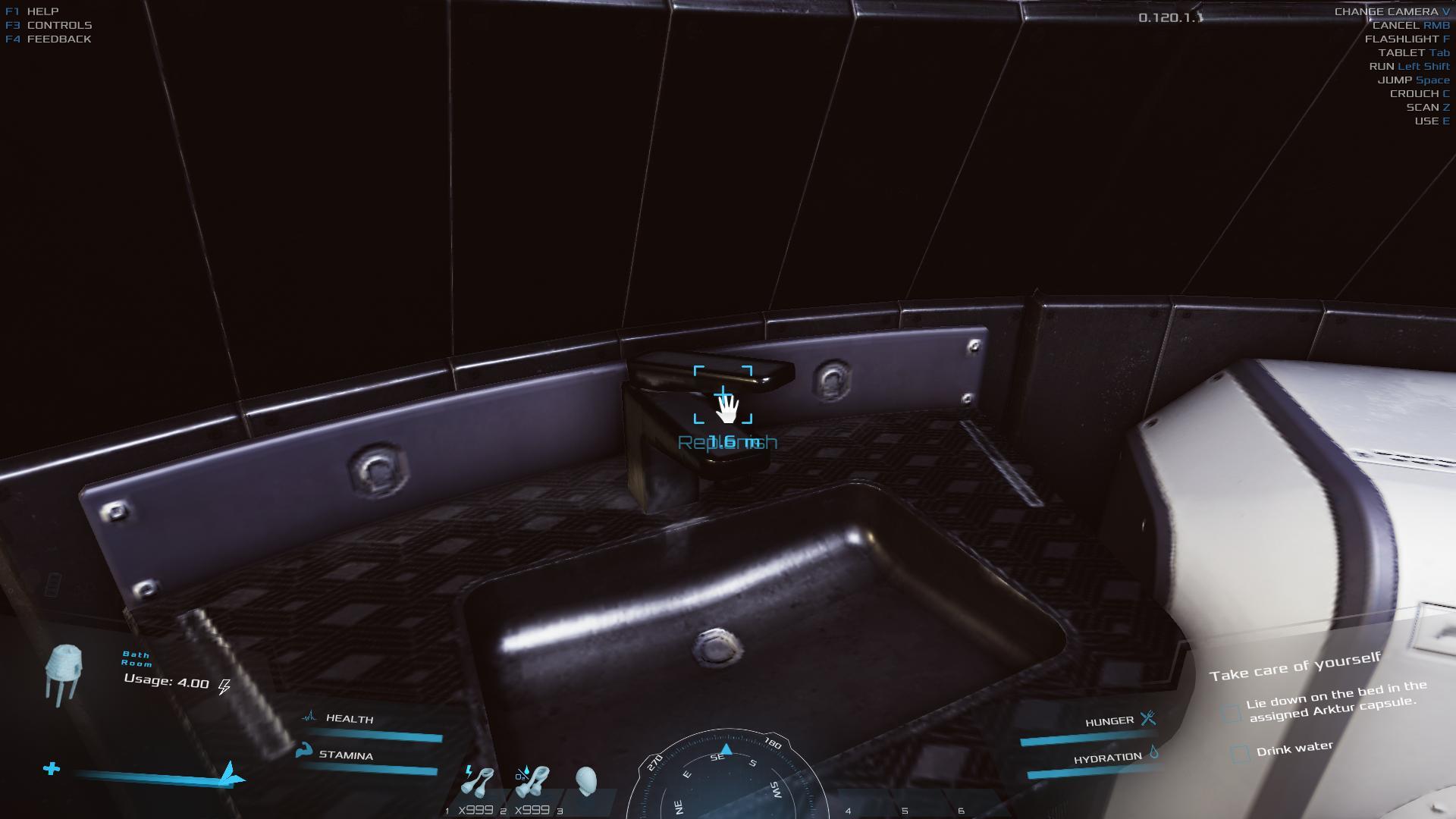
The pale teal text over interactables is frequently difficult to read on items inside hab structures, more so for one with a visual imparement.
Reccomend higher contrast used at base level.
Reccomend inclusion of colour options in future accessibility options.
Gameplay
Ok
0.0220144
Yes
0.120.1.1
Screenshot
