Feedback ticket
Hi there.
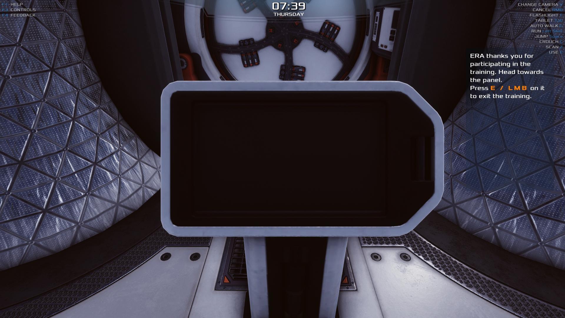
While playing through the tutorial, the colour of the HUD and the background clash making it quite hard to see when the tutorial is explaining the different areas. Maybe you could make it flash up a darker colour to highlight the text and images around the HUD. Apart from that , good so far . :)
Gameplay
Happy
0.013348
Yes
0.142.8.cc005c9b36
Screenshot
