Feedback ticket
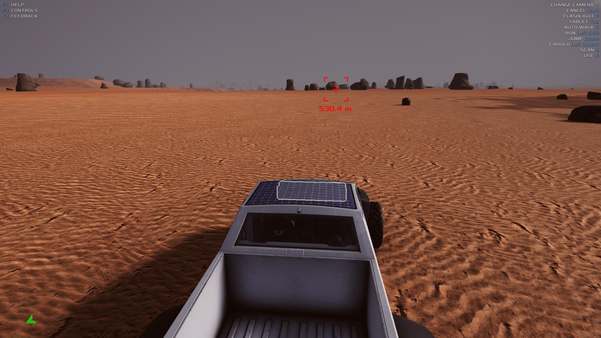
The vehicle UI is pretty poor. With the slight bluish tinge on the white border of pressed buttons (such as lock differential), it's really hard to tell which button is pressed and which isn't without looking really close, making it annoying. it should be more obvious which buttons are toggled and which aren't.
Gameplay
Unhappy
0.0239327
Yes
0.152.10
Screenshot
